UX audit
Disivo is a B2B SaaS platform that helps e-commerce teams monitor competitors and manage pricing strategies across marketplaces.
Due to the size and complexity of the platform, this case study focuses on selected areas (dashboard, product management and search) to demonstrate how key usability issues were identified and addressed.
PROBLEM
Over time, new features were added based on client needs, but without a consistent design approach. As a result, the product became inconsistent across screens and key workflows became complex.
SOLUTION
The goal wasn't to redesign everything, but to make the existing system easier to understand and use. I focused on simplifying complex workflows, improving structure and hierarchy and making interactions more predictable. The aim was to reduce confusion and make the product usable without constant guidance.
PROCESS
Since I didn't have access to users or internal data, I relied on heuristic evaluation and UX best practices. I focused mainly on:
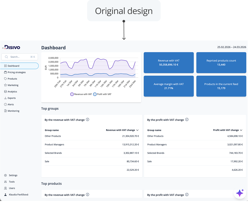
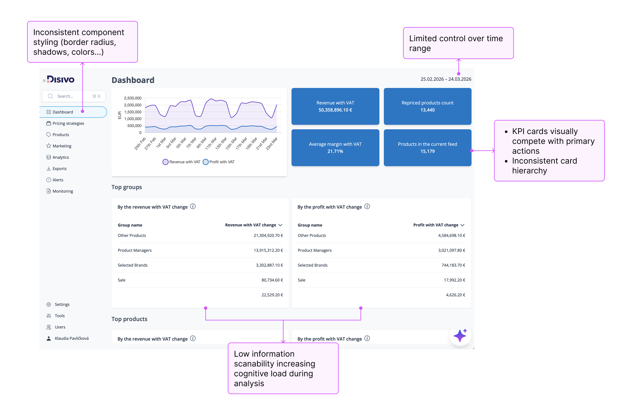
DASHBOARD & NAVIGATION
The dashboard and navigation lacked consistency in layout, component styling, and information hierarchy. Key elements such as KPIs, actions, and navigation patterns competed for attention, making it harder to scan and understand the interface.
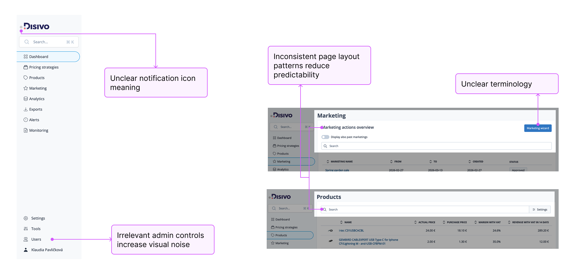
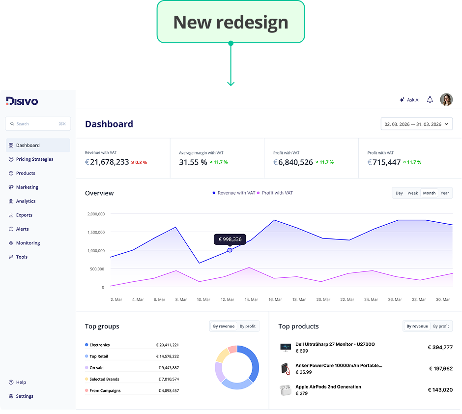
DASHBOARD & NAVIGATION
I explored different layout options to improve hierarchy and predictability. The goal was simple: make it easier to scan, easier to understand, and more consistent across the product.
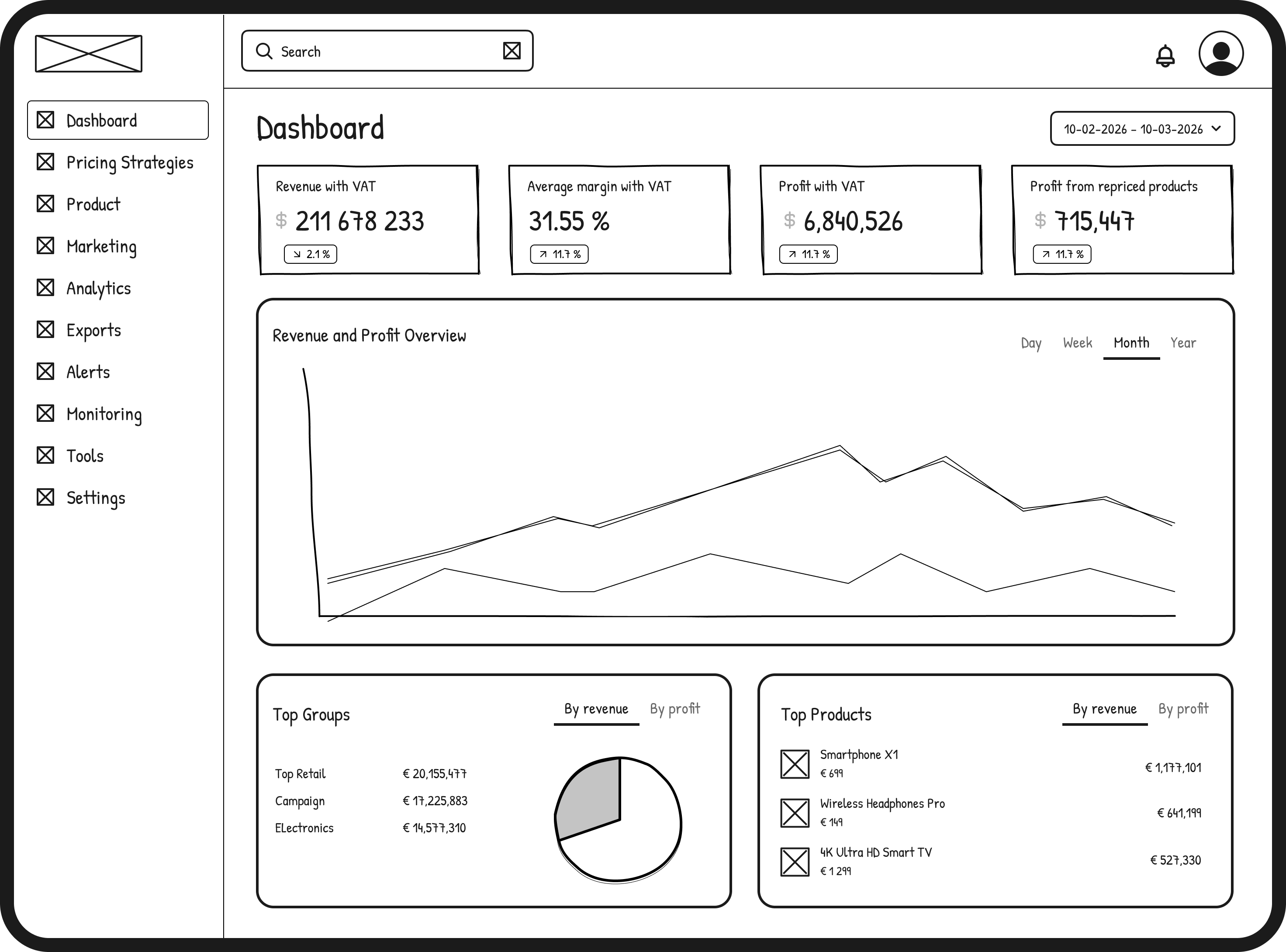
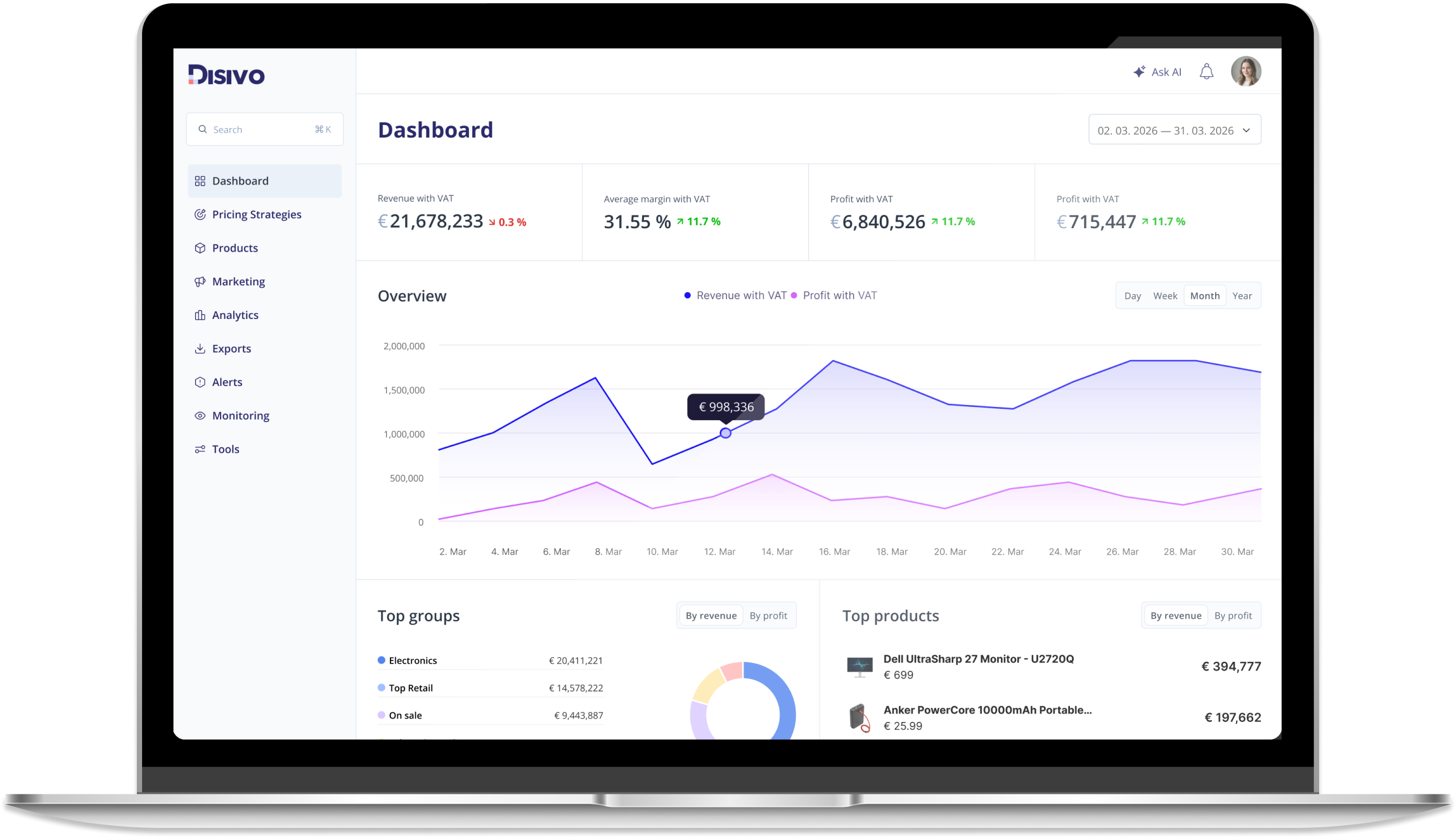
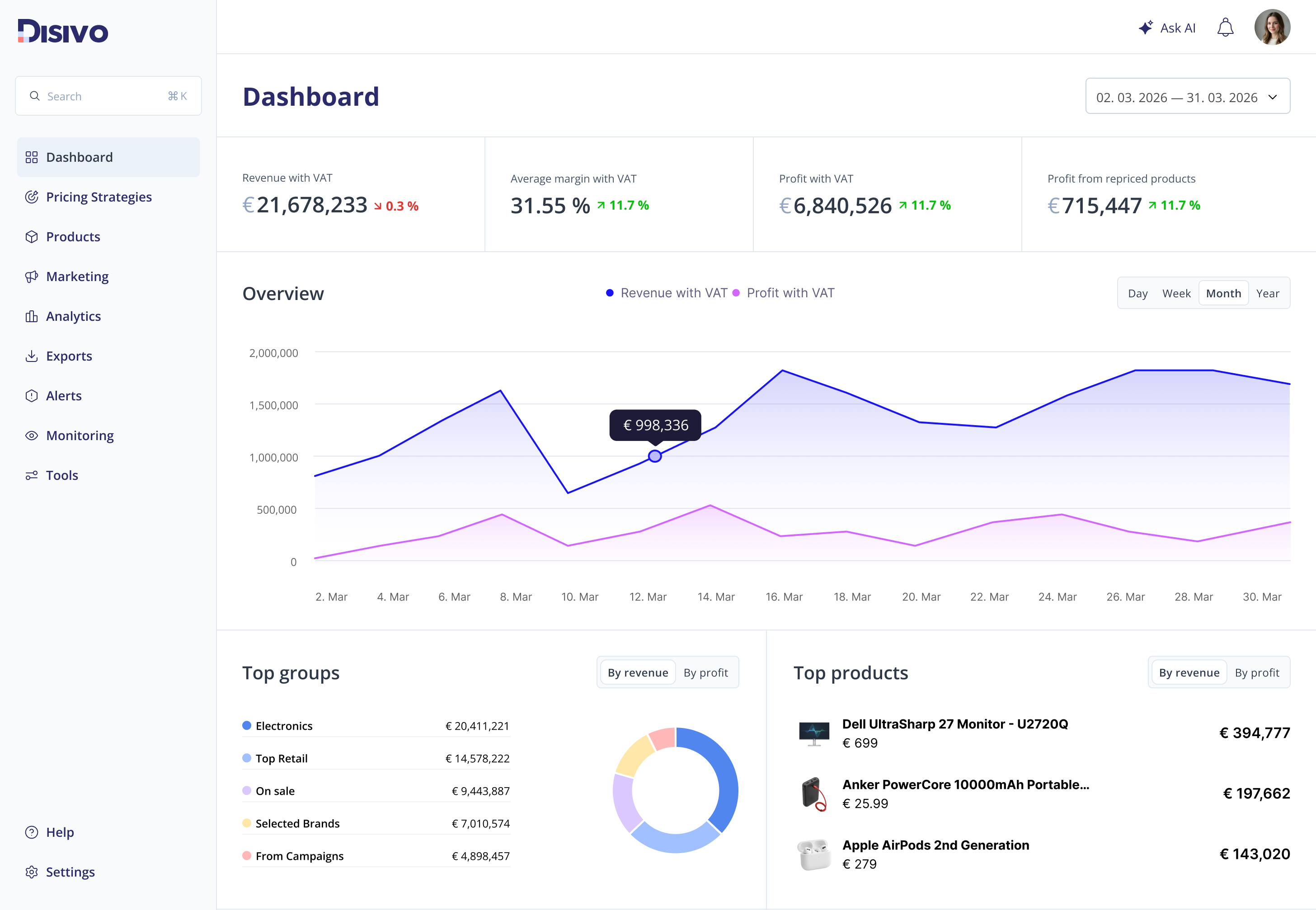
DASHBOARD & NAVIGATION
The final redesign introduces a more consistent and structured interface. It prioritizes key metrics, uses consistent patterns across components, and reduces visual noise. Overall, it makes the interface easier to read and navigate, especially when working with complex data.
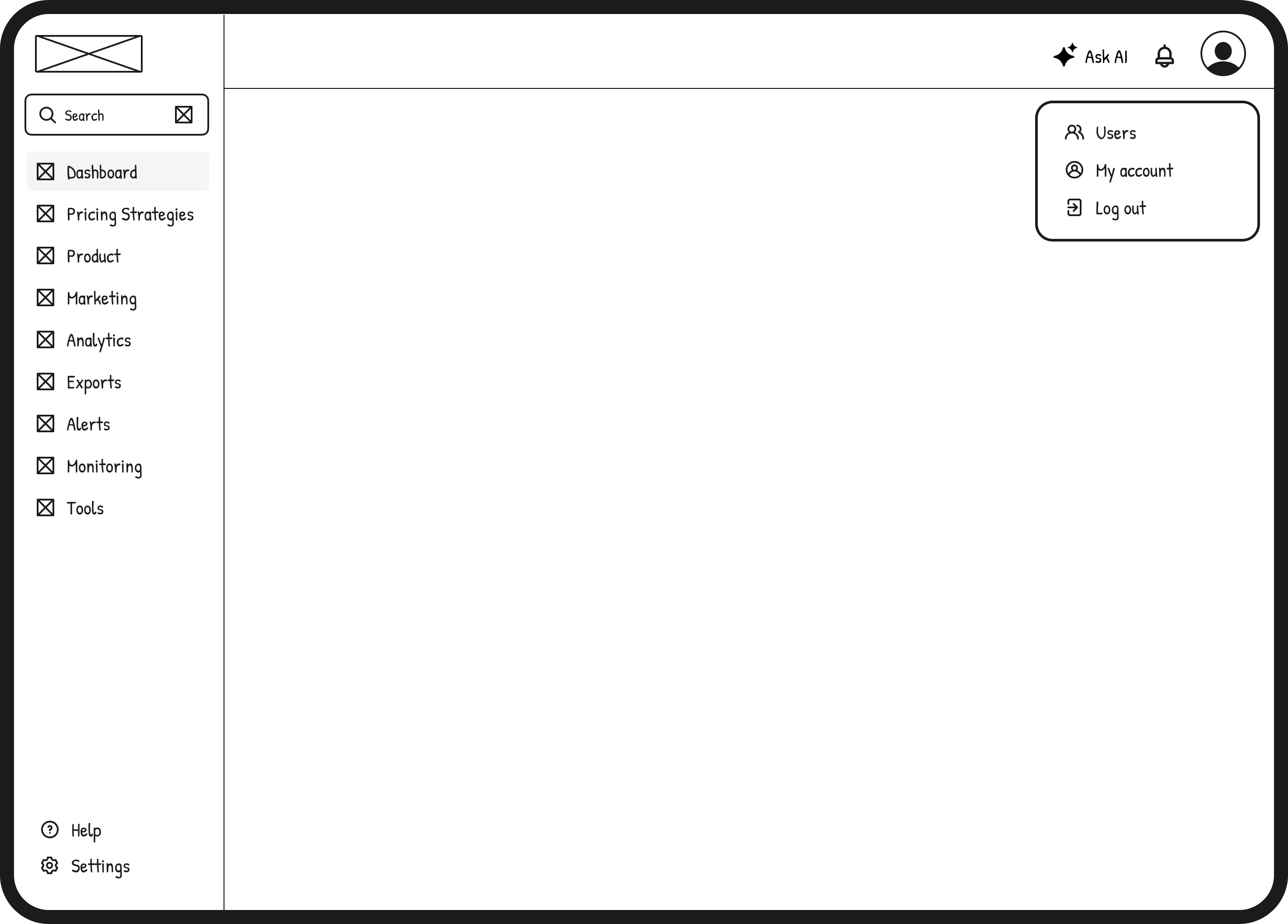
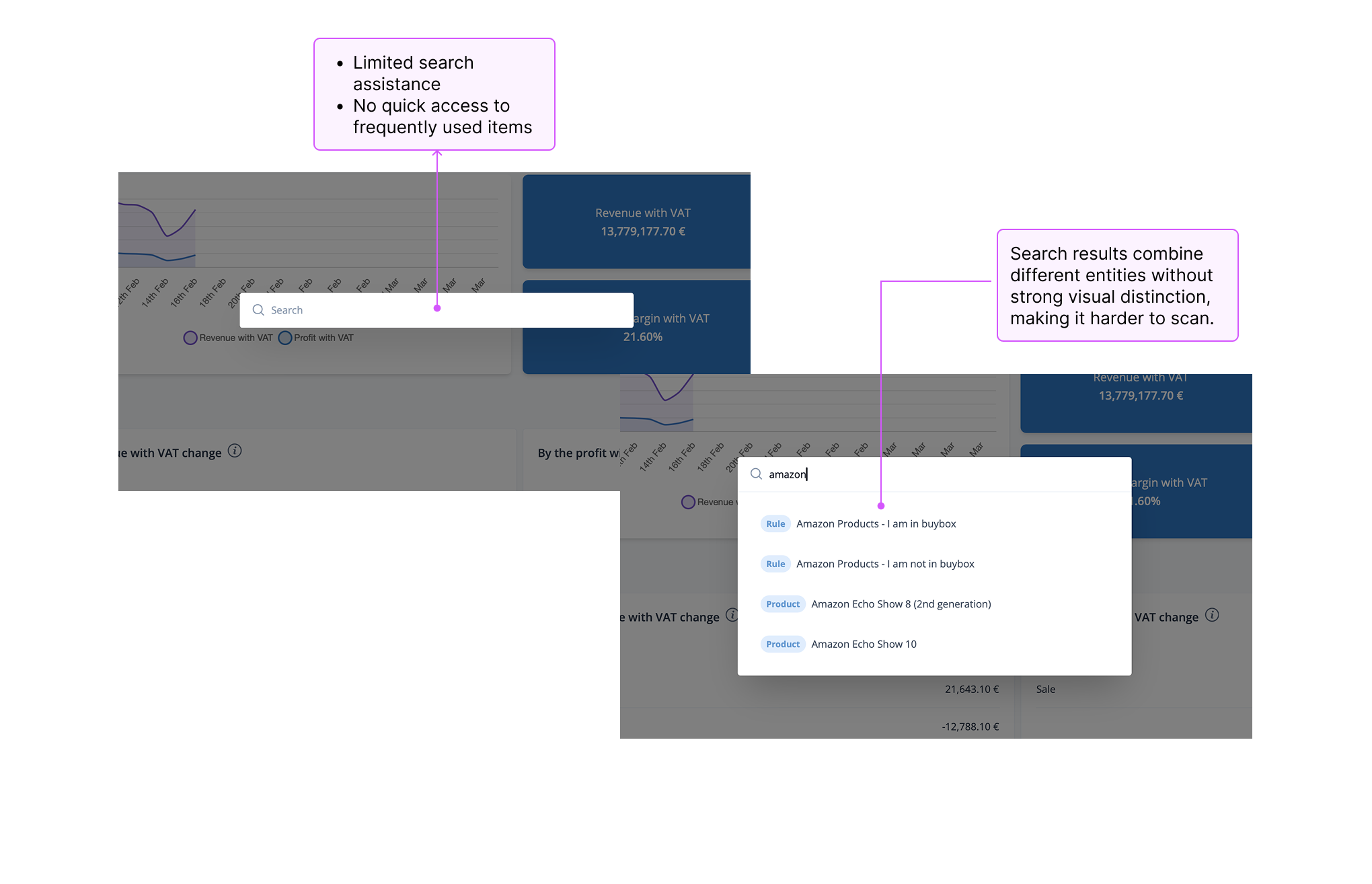
MAIN SEARCH
The original search provided limited guidance and mixed different types of results without clear structure. This made it harder to scan results and quickly access common actions.
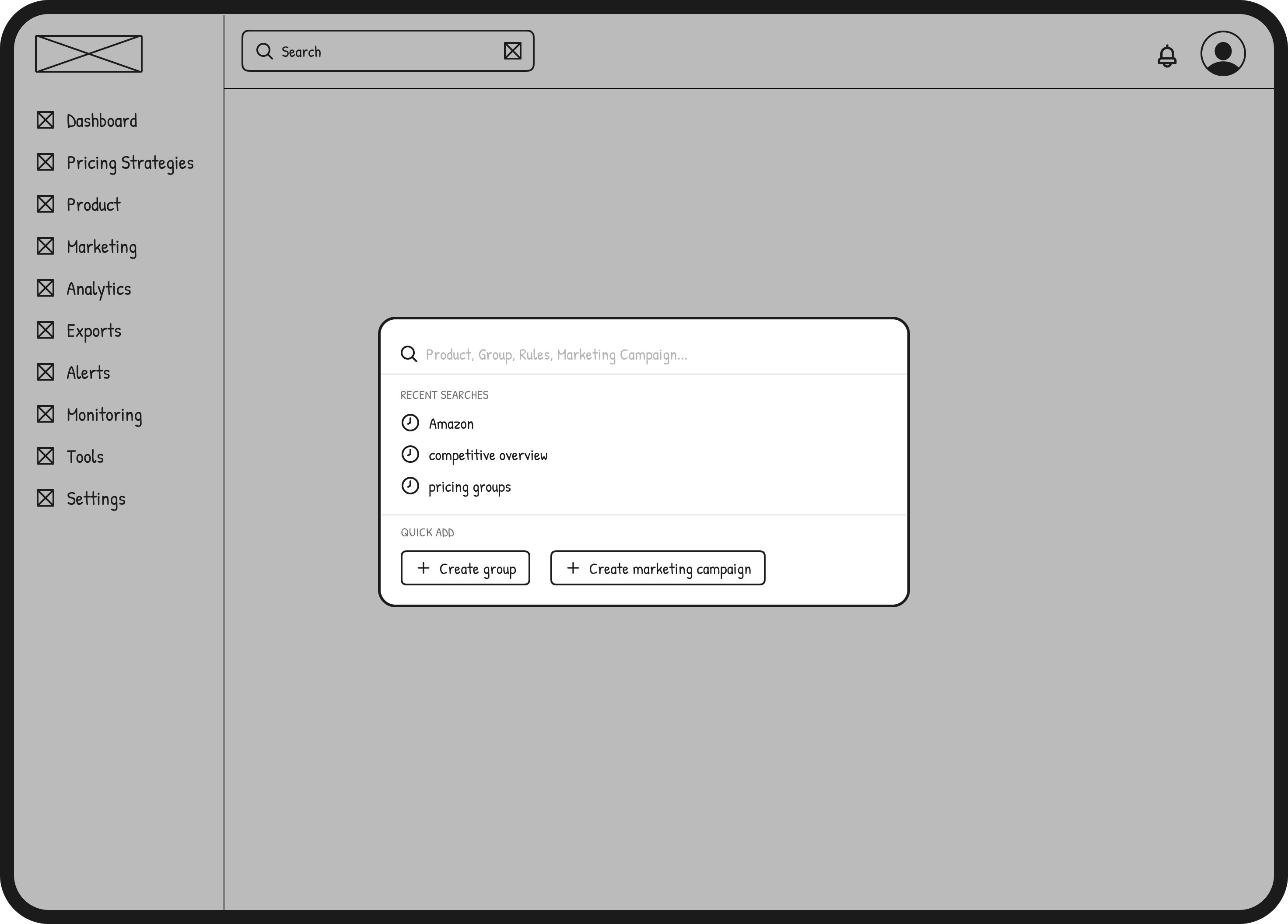
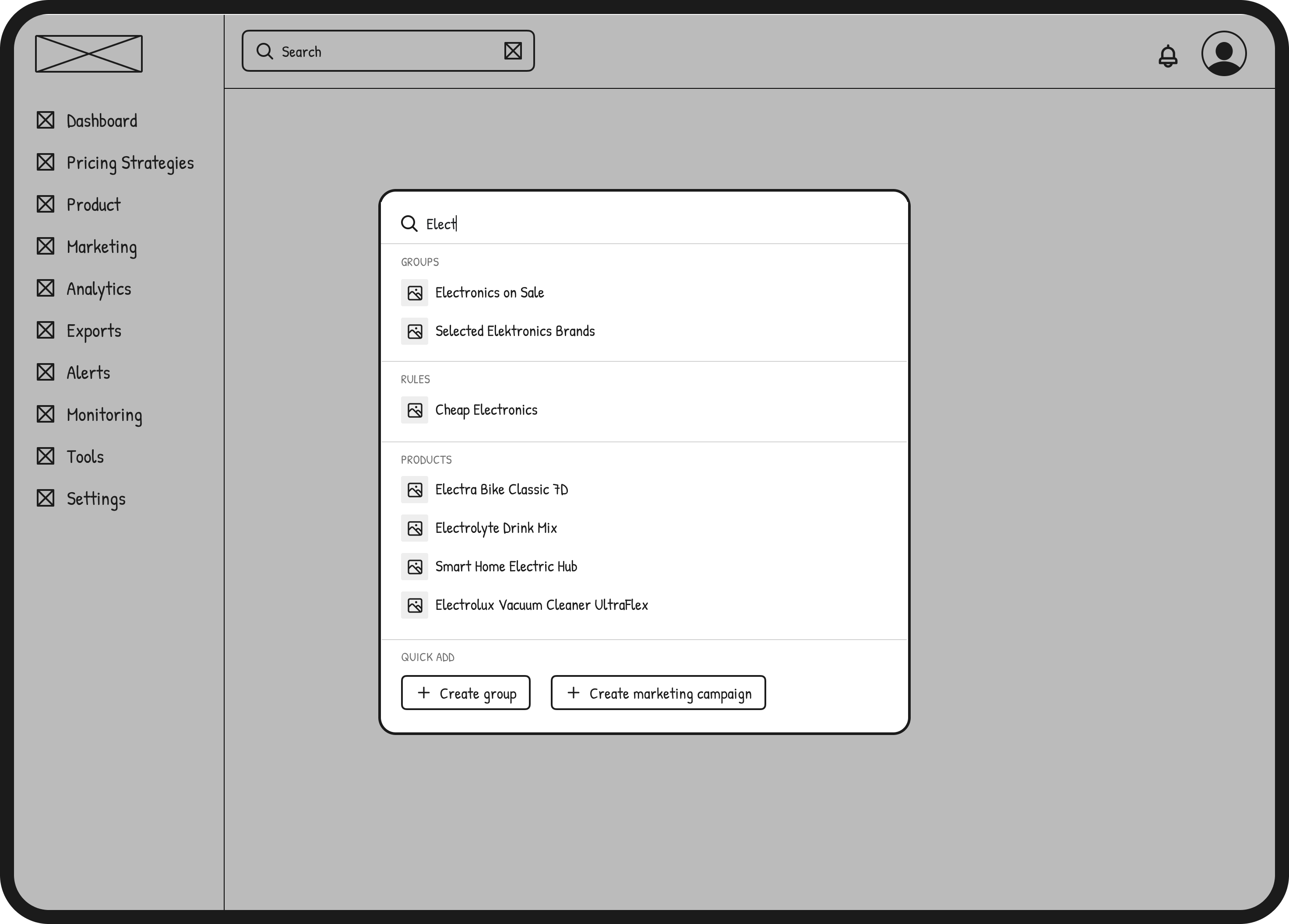
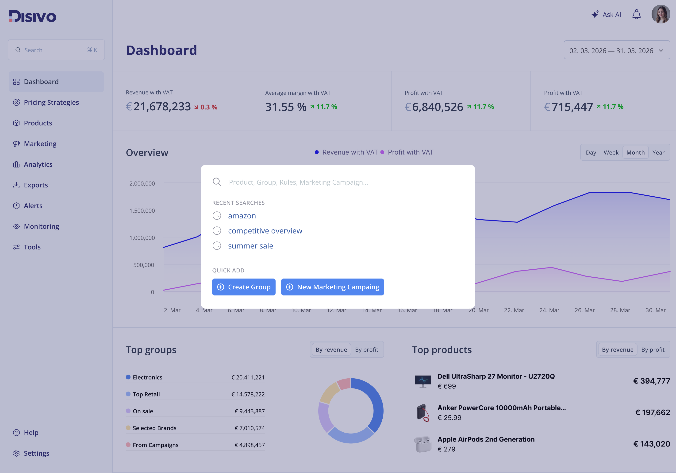
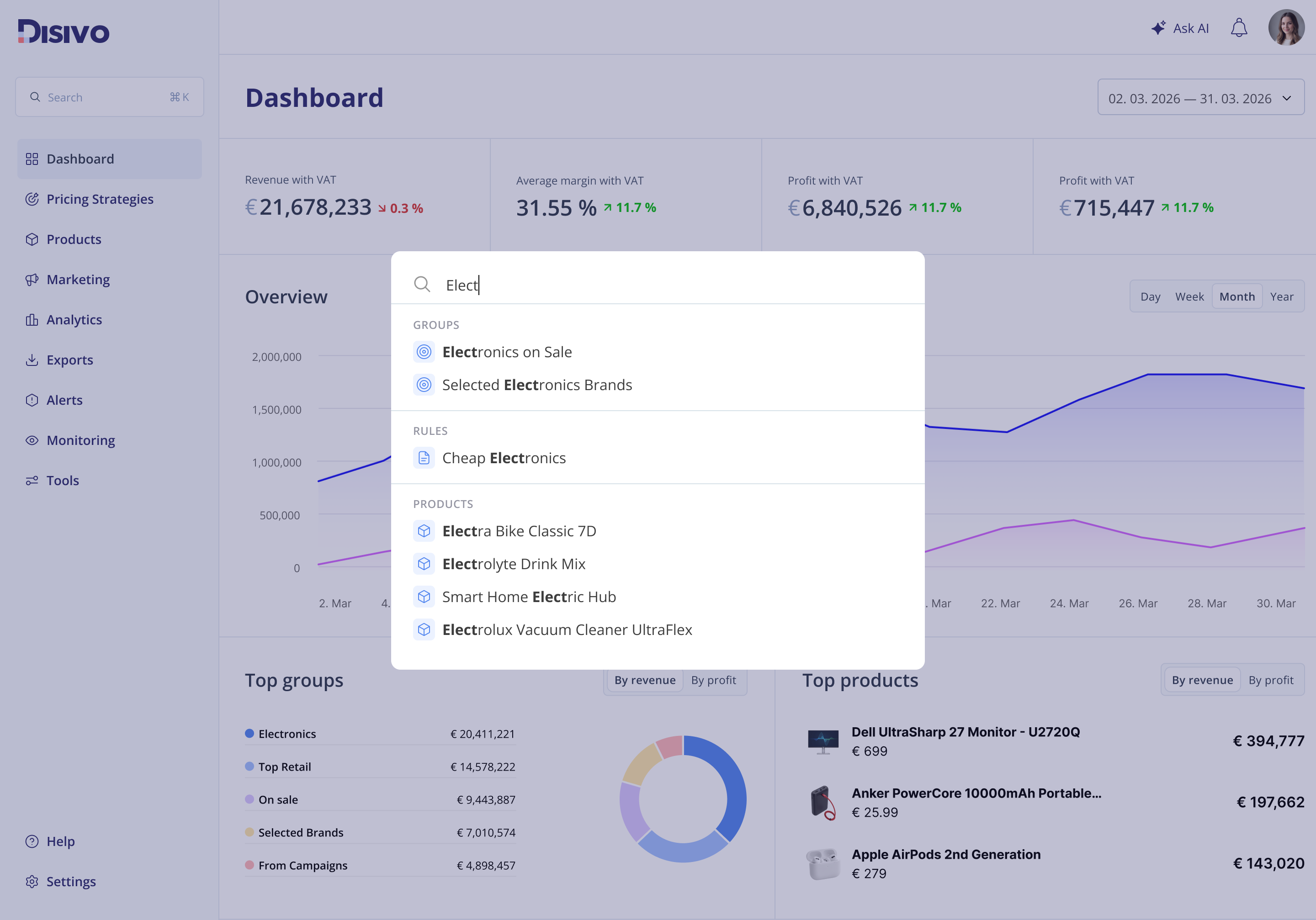
MAIN SEARCH
I explored ways to make search more useful and predictable by introducing clearer grouping, better visual hierarchy, and quick access to common actions. The goal was to support both quick lookups and deeper navigation from a single entry point.
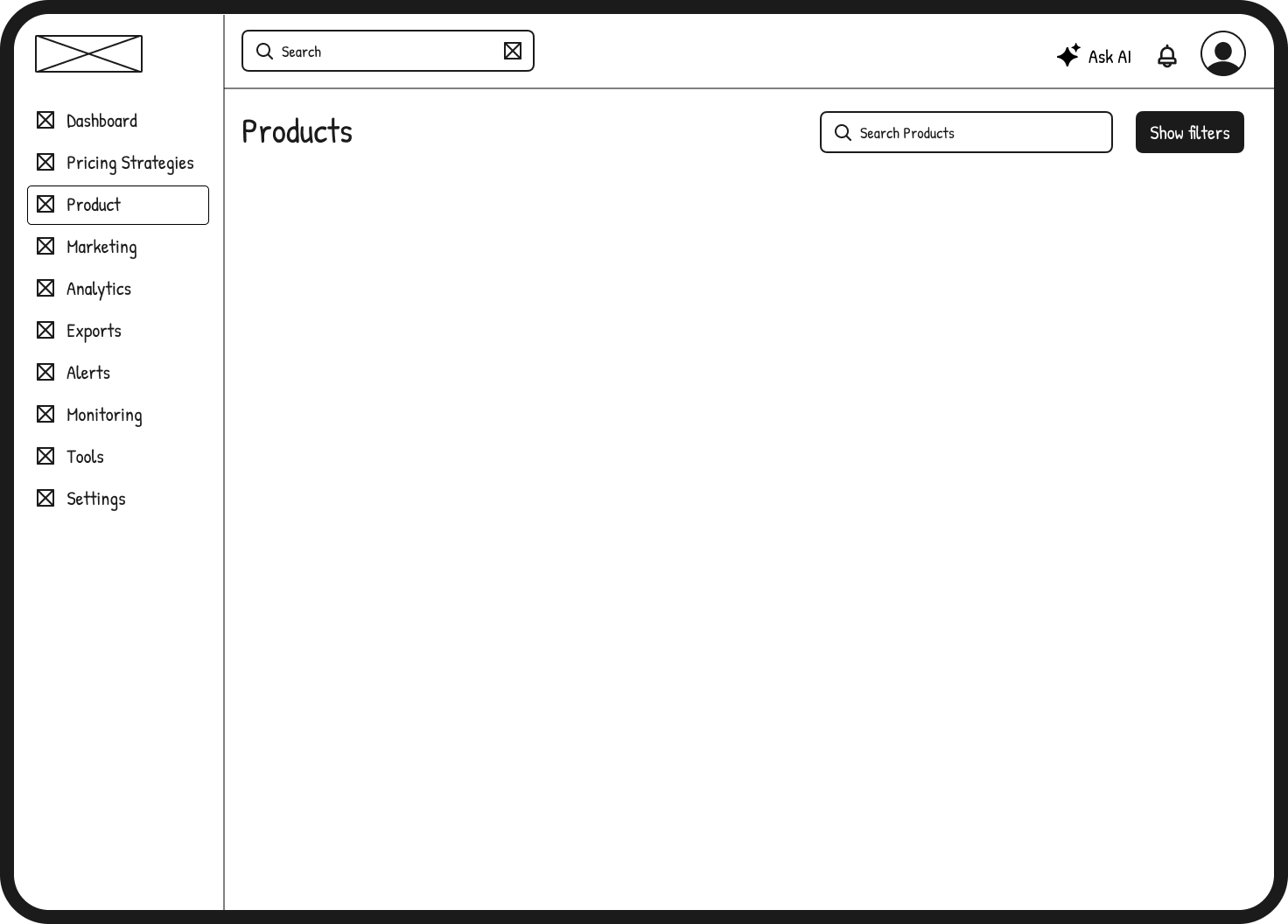
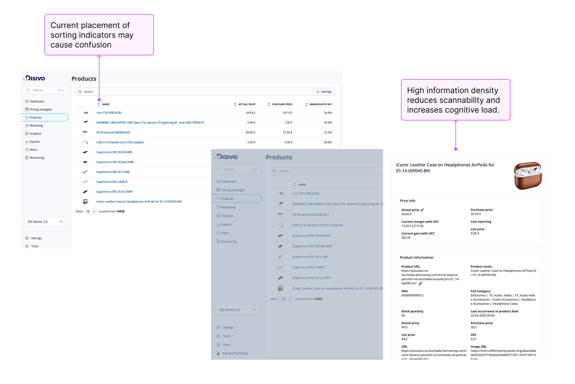
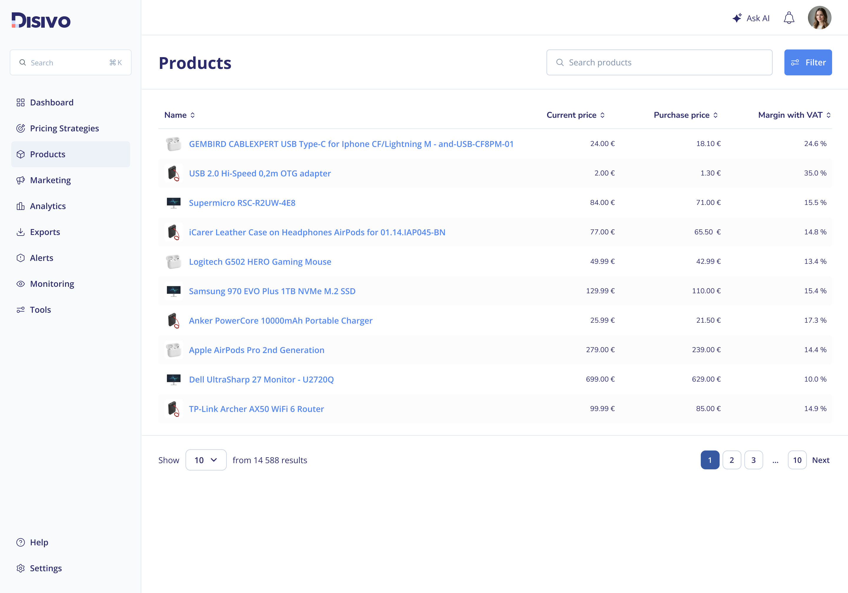
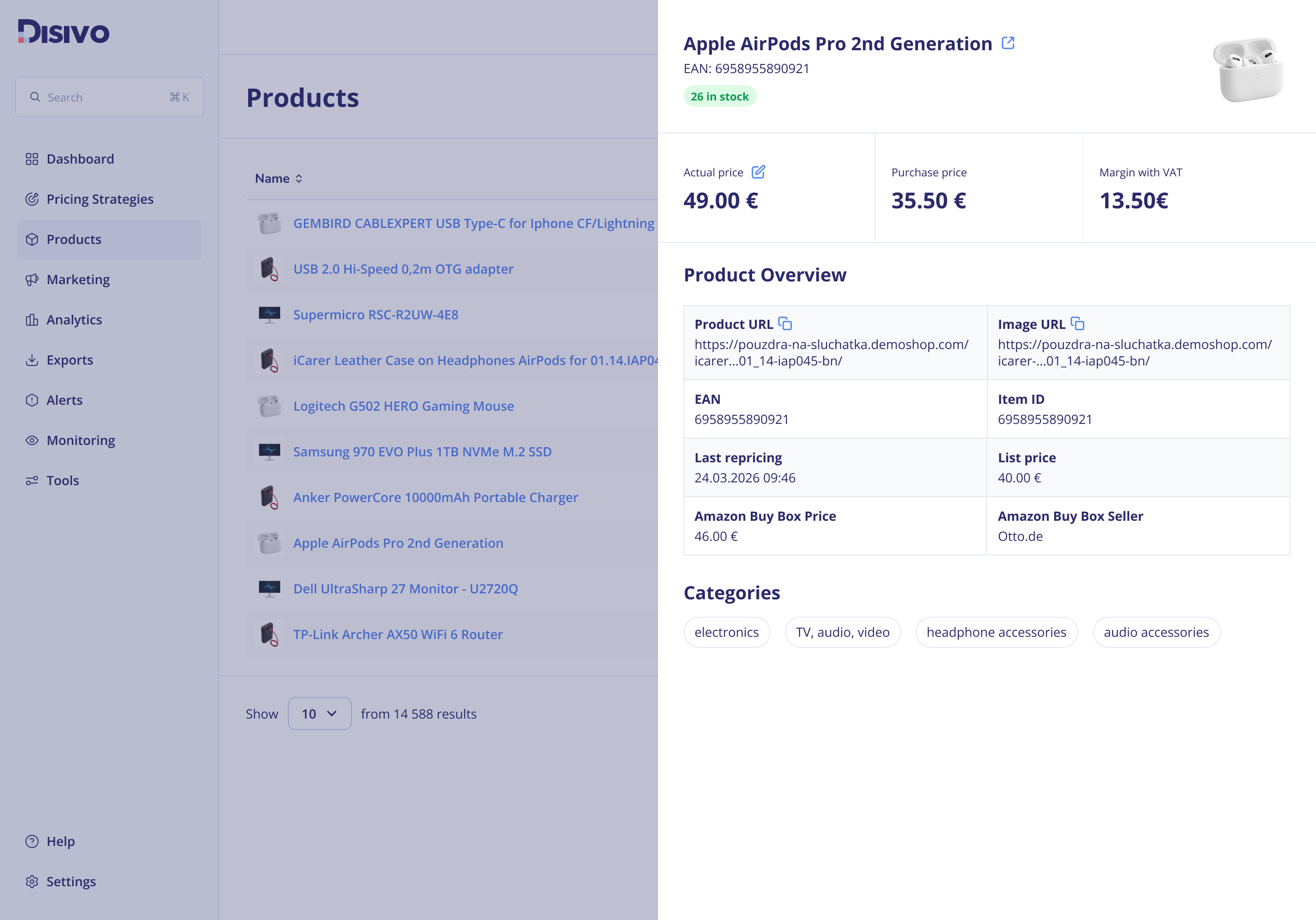
PRODUCTS
The products page was data-heavy with unclear hierarchy, making it difficult to scan, sort, and quickly understand key information. The redesign improves structure and hierarchy, making product data easier to scan, compare, and navigate.
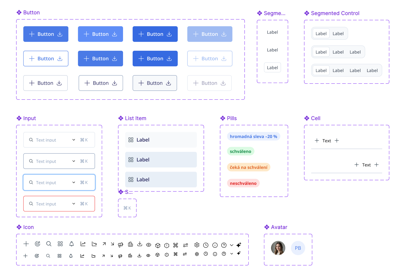
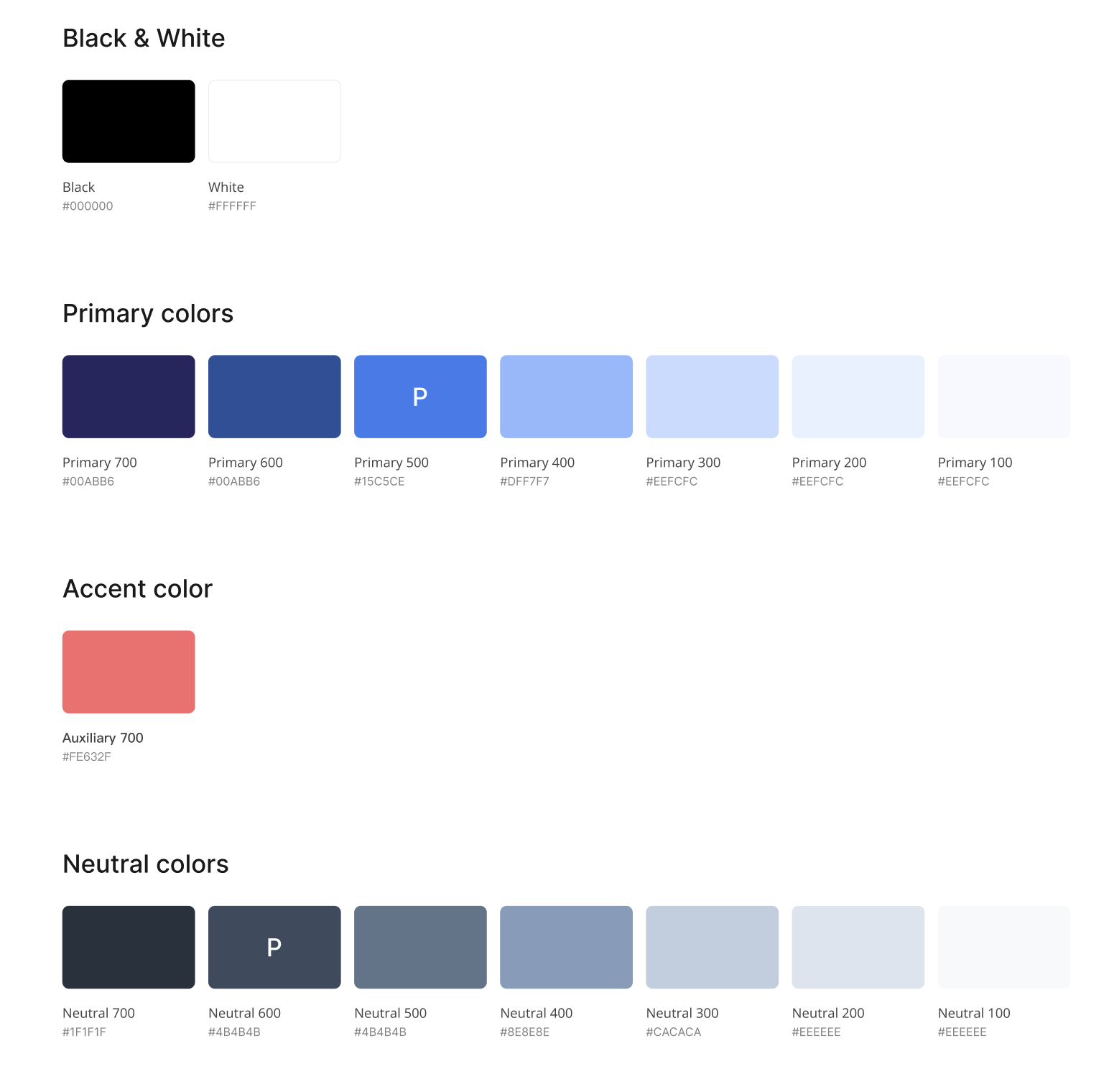
STYLE DEFINITION
To support long-term consistency, I created a basic style guide covering core components, patterns, and visual rules. This gives the team a foundation to build on, instead of adding more inconsistencies over time.