UX case study
HLIDACKY.CZ | SITTERS.AT | SITERICE.HR | BEBICSOSZ.HU | HLIDACKY.SK
Hlidacky.cz is a digital marketplace connecting families with caregivers for services such as babysitting, cleaning, pet care, tutoring, and elderly care. The platform serves over 600 000 registered users and operates across 5 Central European markets.
PROBLEM
Even though users paid for memberships that included booking credits, insurance, and in-app payments, most of them actually avoided using the booking flow. This created a disconnect between what the product was designed for and how people were really using it. As a result, engagement dropped, risk increased (bookings happening outside the platform), and it reduced the overall value of memberships.
SOLUTION
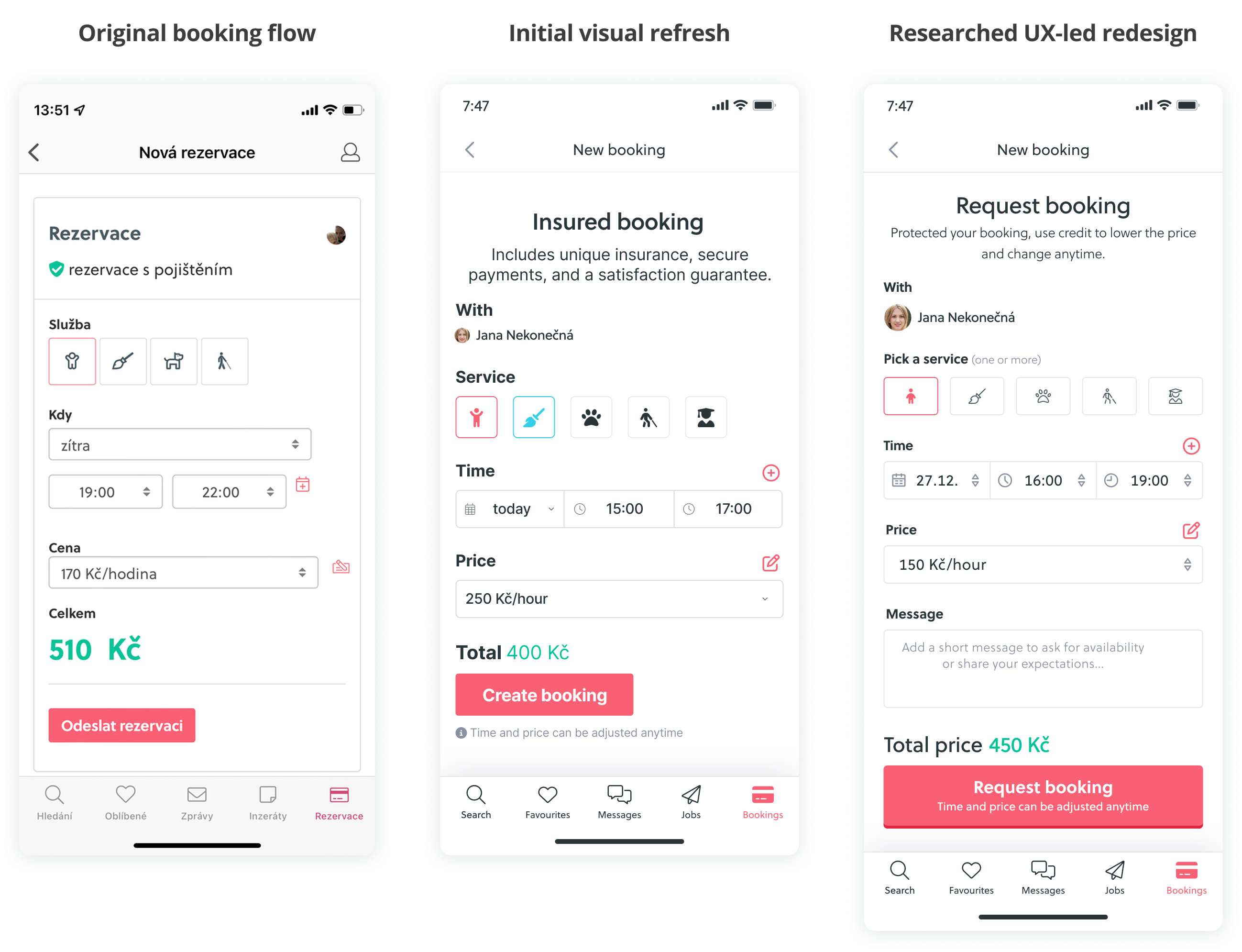
PROCESS
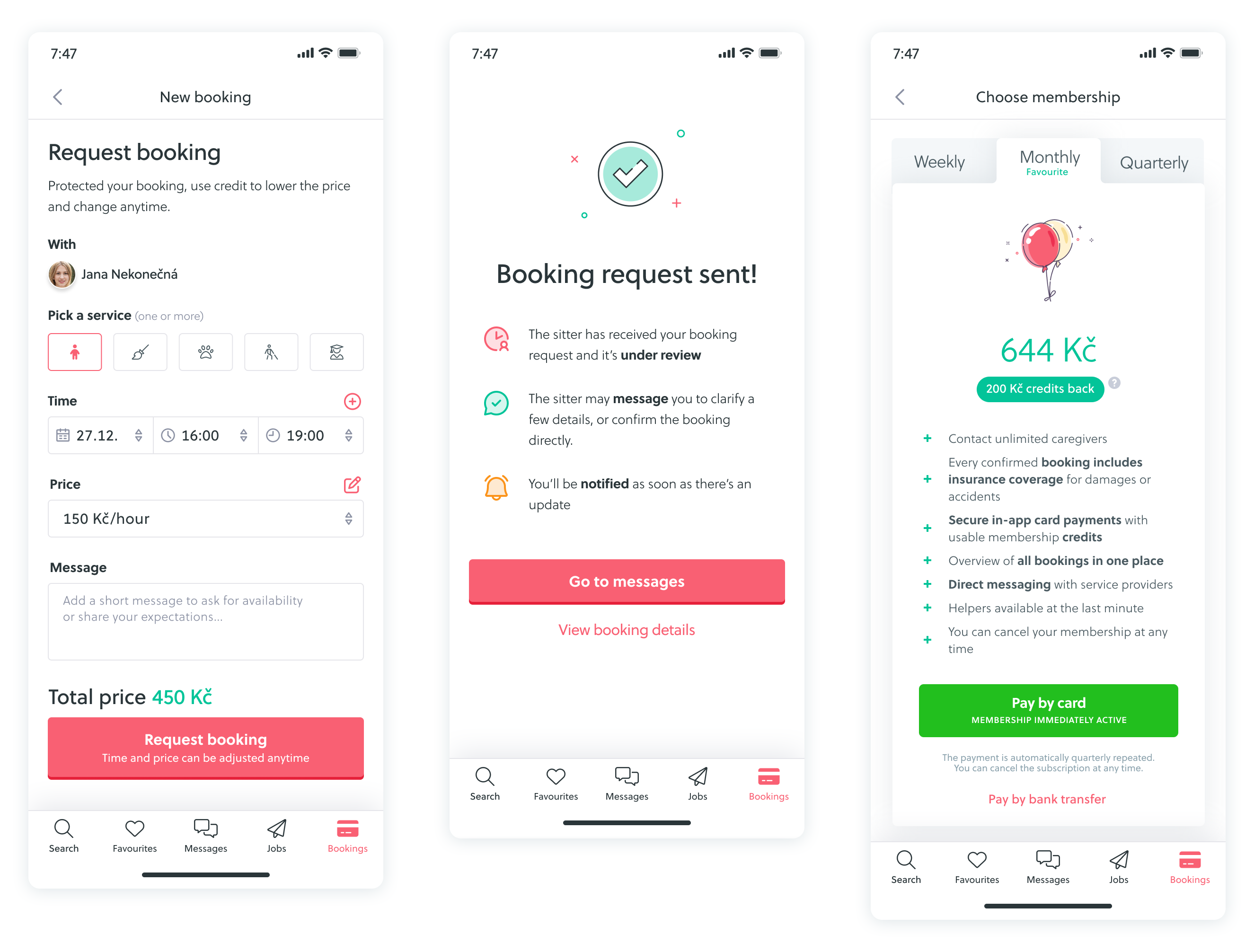
To understand what was really happening, I ran task-based usability tests on a Figma prototype of the current booking flow.
I used Maze to track how people interacted with the flow and which contact method they naturally chose.
RESEARCH
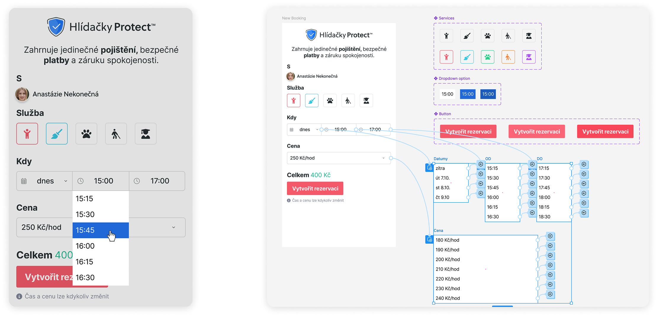
After completing the task, participants answered open-ended questions about what they were thinking, what felt unclear, and why they made certain decisions. I also tested 3 CTA variations to see which wording reduced hesitation and encouraged users to move forward.
KEY INSIGHTS
Users weren't avoiding booking because they didn't want to use it. They were hesitating because they didn't feel ready yet. Booking felt like a final step, while most users were still figuring things out.
perceived the booking button as too final
prefered personal contact before booking
concerned about the sitter's availability
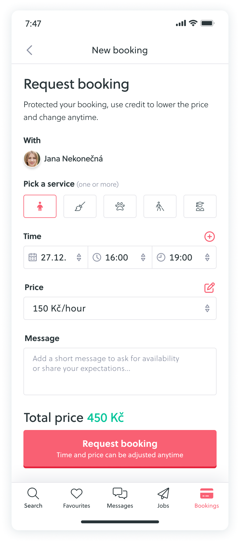
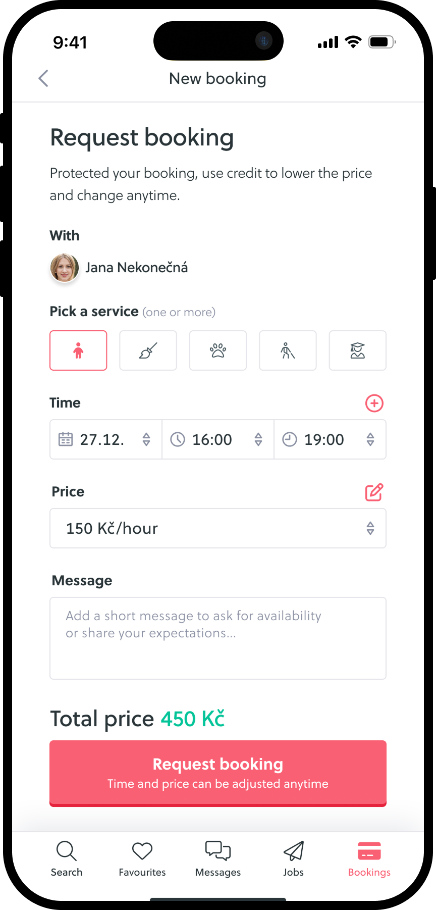
Booking feels like a final commitment
I wasn't sure whether I could still change the time afterwards.
I feel like it becomes binding immediately.
Booking feels like the final step to me.
Users need communication before commitment
I need to agree on the details first before I confirm anything.
Messaging feels easier because we can both reply when we have time.
Booking feels too anonymous
Lack of transparency increased anxiety
I'm worried the sitter won't confirm the booking.
I'm not sure whether the booking will be confirmed in time.
I don't know what happens after booking
IDEATION & IMPROVEMENTS
Based on research and feedback I suggested these 4 main improvements:
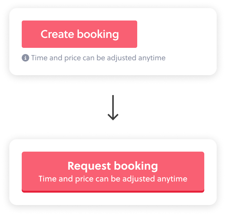
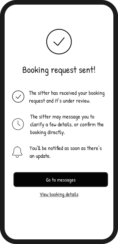
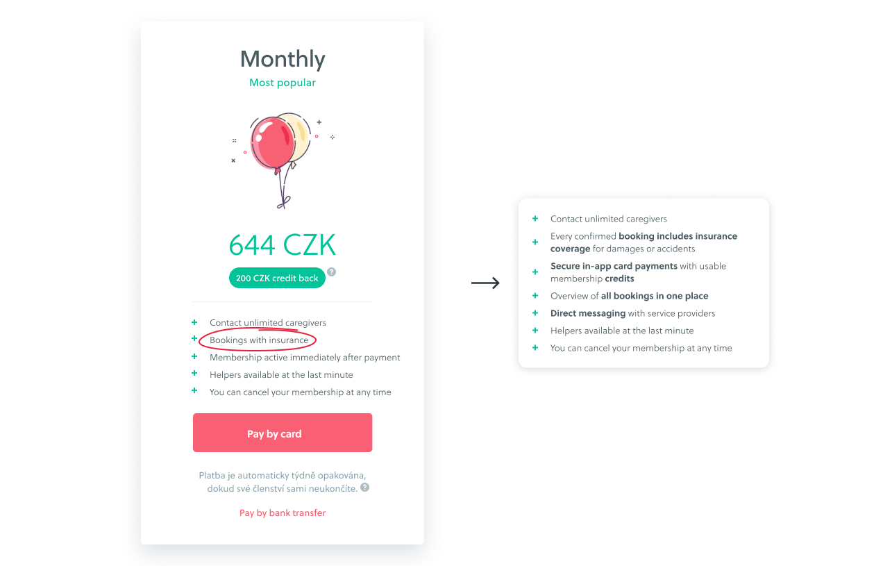
The final designs focused on reducing perceived commitment, improving clarity around next steps, and showing the value of booking earlier in the journey.
VALIDATION
The updated booking flow is currently being A/B tested. Final results are still pending.
Suggested metrics to track: