UX case study
HLIDACKY.CZ | SITTERS.AT | SITERICE.HR | BEBICSOSZ.HU | HLIDACKY.SK
Hlidacky.cz is a digital marketplace connecting families with caregivers for services such as babysitting, cleaning, pet care, tutoring, and elderly care. The platform serves over 600 000 registered users and operates across 5 Central European markets.
PROBLEM
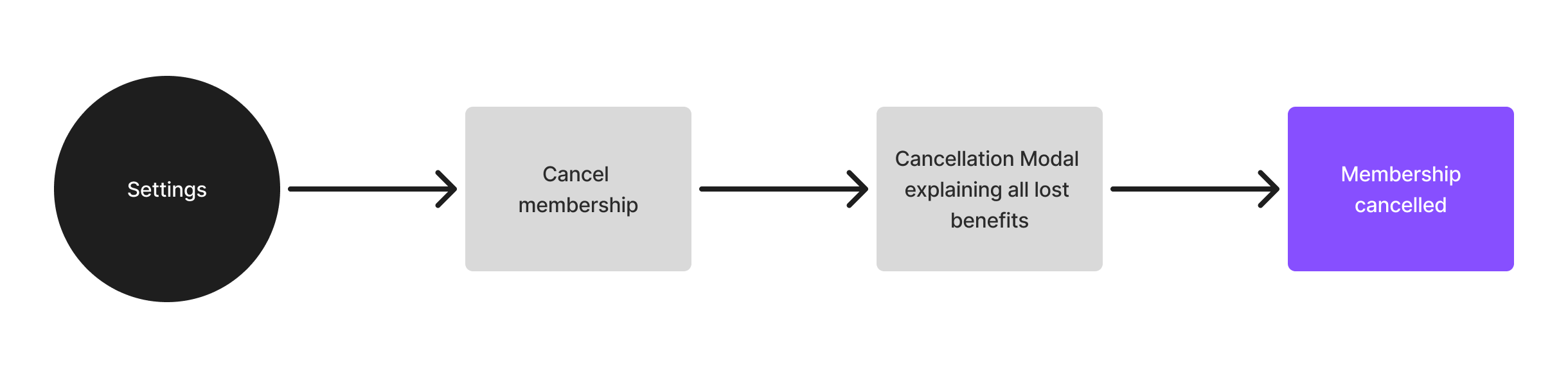
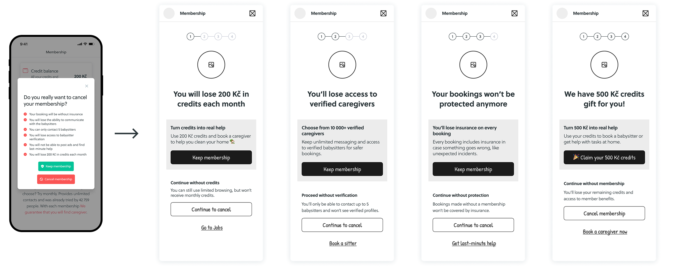
The cancellation flow was just a single confirmation modal. Users could cancel in one step, without really understanding what they were losing or considering other options. From a business perspective, this meant people were dropping off too fast, with no real chance to re-engage them.
This led to:
SOLUTION
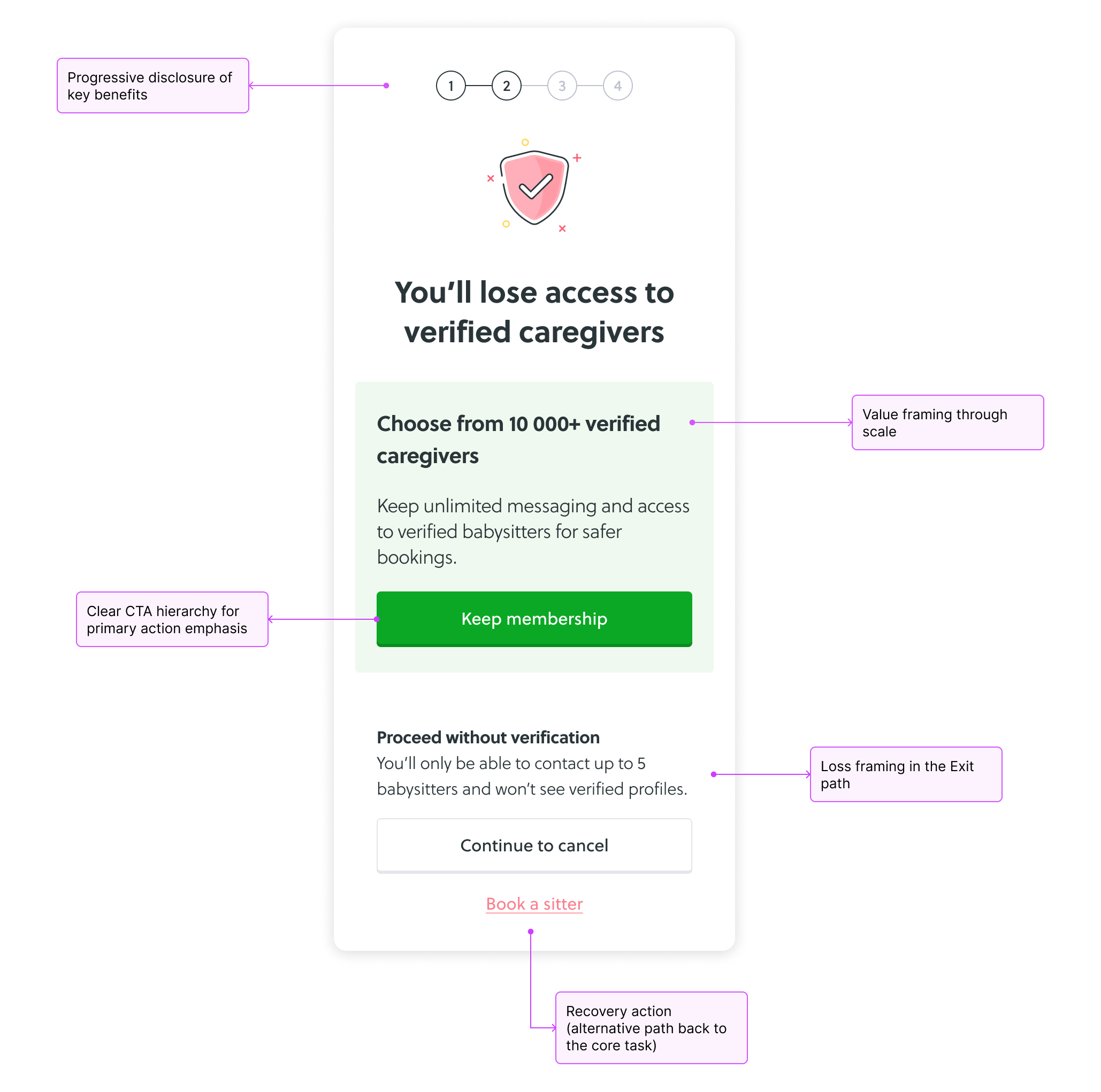
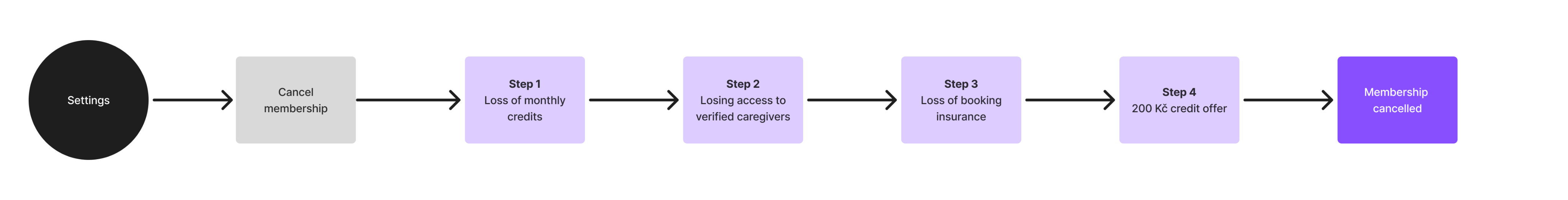
The cancellation modal was replaced with a multi-step flow that gradually showed what users are giving up, reminded them of the value they already have and offered alternatives before they cancel.
IMPACT
TASK FLOW ANALYSIS
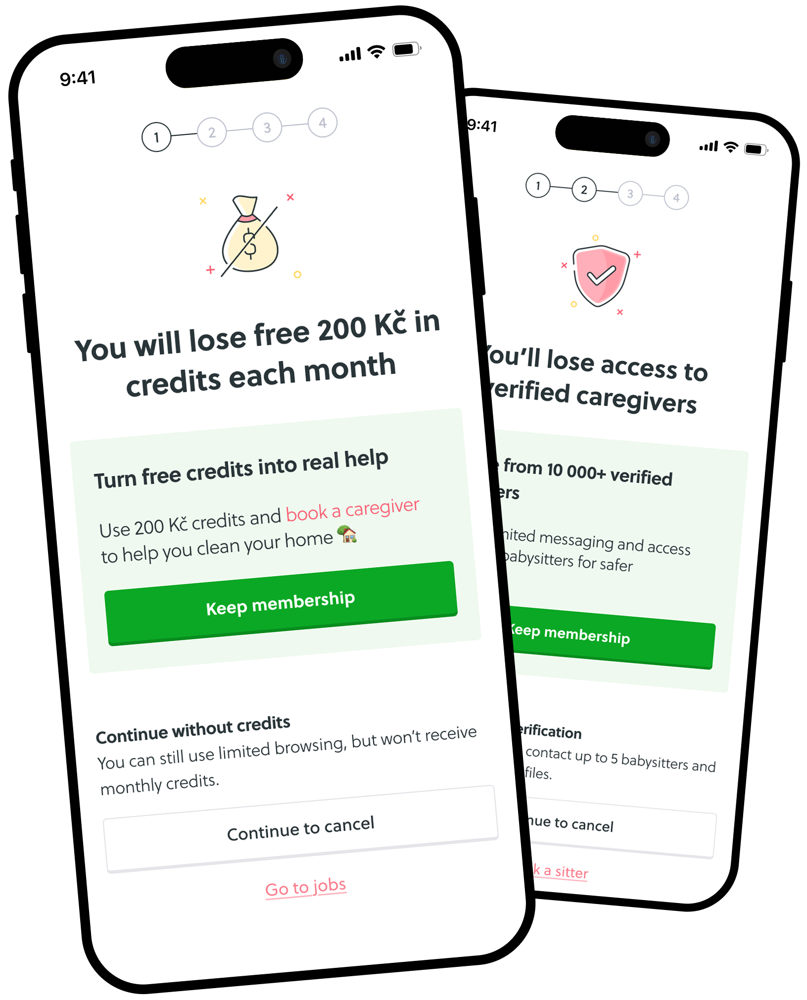
The original cancellation flow relied on a single confirmation step, allowing users to cancel without fully understanding the impact. I mapped the existing flow to identify key decision gaps.
The redesigned flow introduces a guided decision process with 4 checkpoints that progressively communicate membership value: financial value (credits), access (verified caregivers), safety (insurance), and incentive (extra gift).
WIREFRAMES
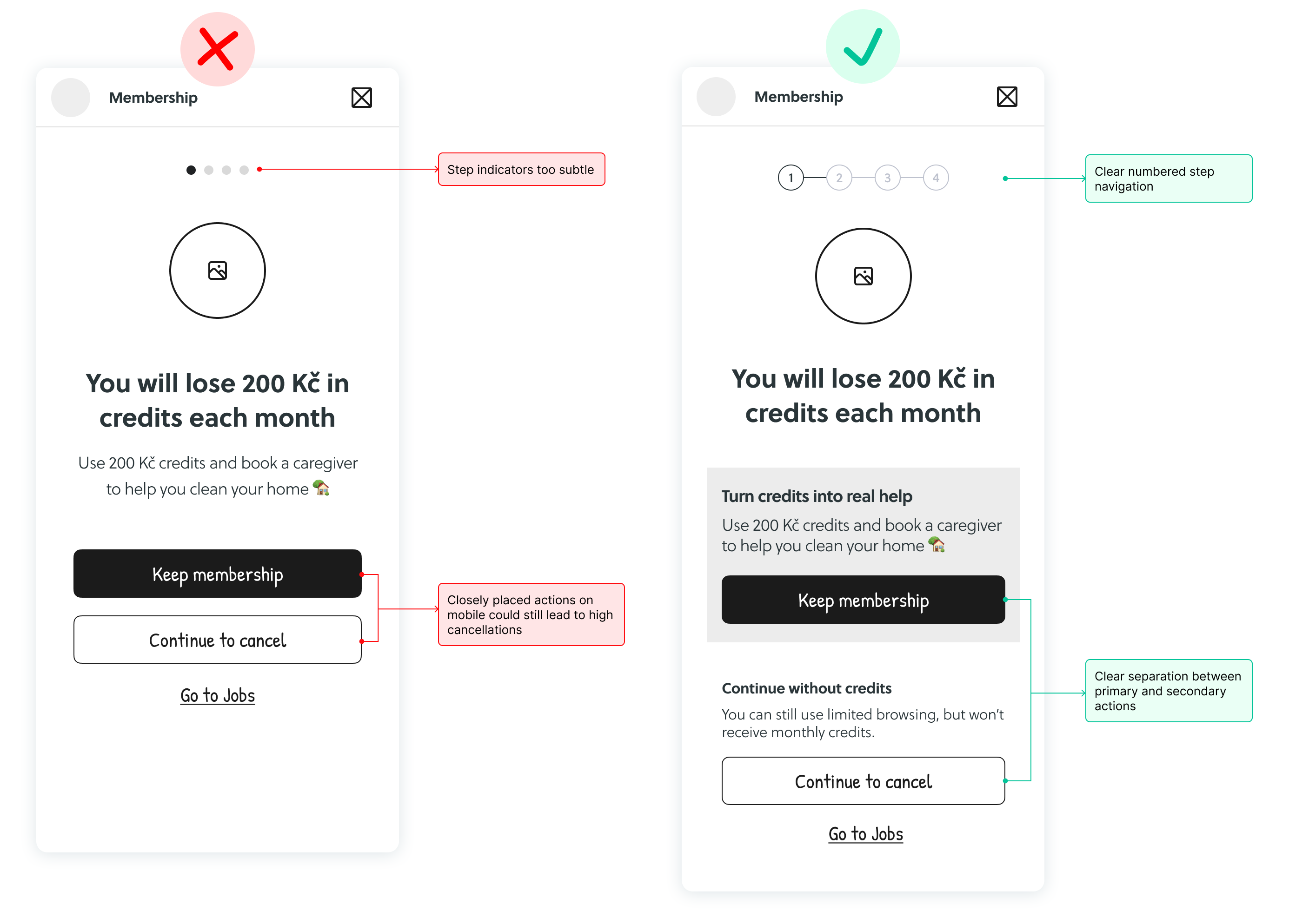
Early explorations revealed some issues especially on mobile. Subtle step indicators and closely placed actions could lead to accidental cancellations. Based on these insights, I adjusted the layout to make steps more obvious, separate primary and secondary actions and reduce accidental taps.
Key Design Decisions & UX Principles
The redesign applies principles of progressive disclosure, choice architecture, and behavioral decision design to create a more intentional cancellation experience.
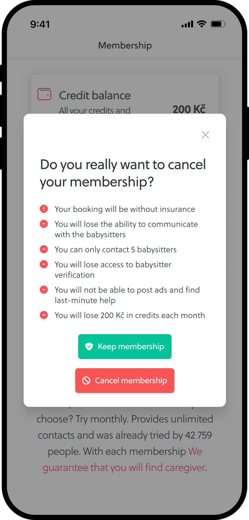
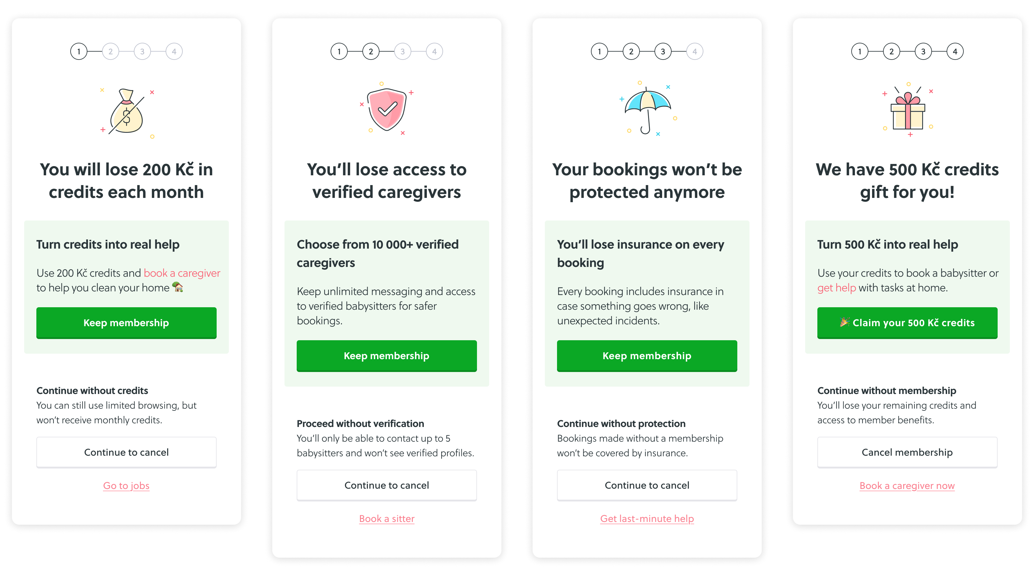
Instead of showing everything at once I spread the information across 4 decision steps. This reduces cognitive load and allows users to process one piece of information at a time while gradually giving users time to reconsider.
Each step focuses on a different aspect of membership value: financial benefits (credits), platform access (verified caregivers), safety (booking insurance), and an incentive (credit offer). Presenting these progressively builds a clearer picture of what cancellation actually means.
The "Keep membership" action is presented as the primary CTA, while the cancellation option remains accessible as a secondary action. The goal wasn't to trap users, but to guide attention and reduce impulsive decisions. Additional spacing and grouping reduce the risk of accidental taps on mobile devices.
The final design slows users down just enough to think, makes the value of membership more visible and at the same time keeps cancellation straightforward and accessible.
VALIDATION
Due to time constraints, I skipped usability testing and validated directly with A/B testing.
RESULTS
This showed a significant uplift in retained revenue and confirmed that the multi-step flow positively influenced user behavior.

If I had more time, I would: